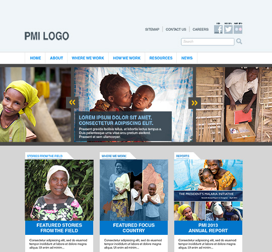
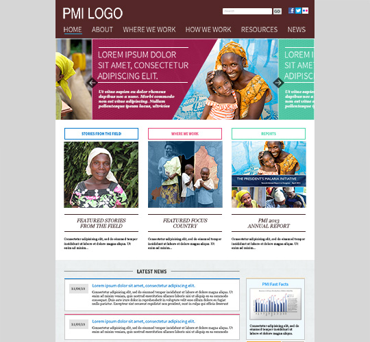
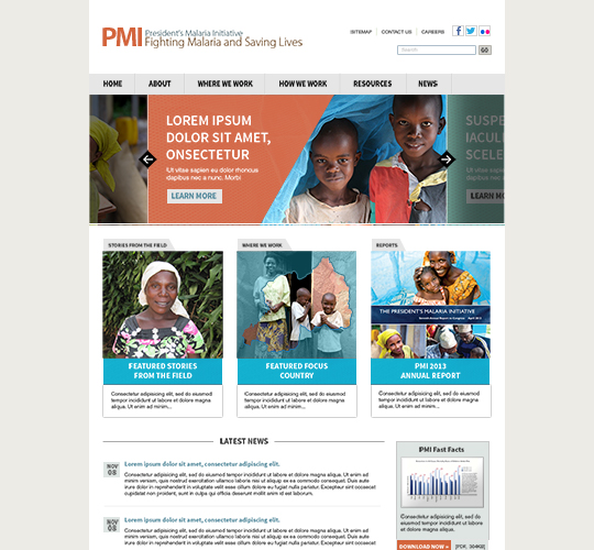
A 7-year-old site showing signs of age
As a contractor for the United States Agency for International Development (USAID), I was responsible for the development, production and dissemination of web content for PMI. From a content editing perspective, the site was difficult to maintain. The site was composed of static HTML files. Without a user-friendly Content Management System (CMS) in place, only technical staff could update content. Updating content often involved editing several pages in a tedious fashion because nothing was dynamic, and left room for human error in times of crunch. Information was often out of date and broken links were not uncommon to discover.
PMI also needed user experience improvements. The site was difficult to navigate, and usability seemed like an afterthought. Many key pieces of content would take over 4 clicks to get to the destination and were not easy to find. PMI was accomplishing great things, but their content was not displayed in a visual and compelling way for the users. The design of the site itself looked very dated. Many photos used were point and shoot pictures that didn't tell a strong story. The website often had imaged based text, which was bad for Search Engine Optimization. The typography did not have well designed hierarchy, and many parts of the site had small 11 pixel sized text that was hard to read. The site was still using Adobe Flash in certain areas, which was a security concern with the app’s many vulnerabilities.
Putting UX first
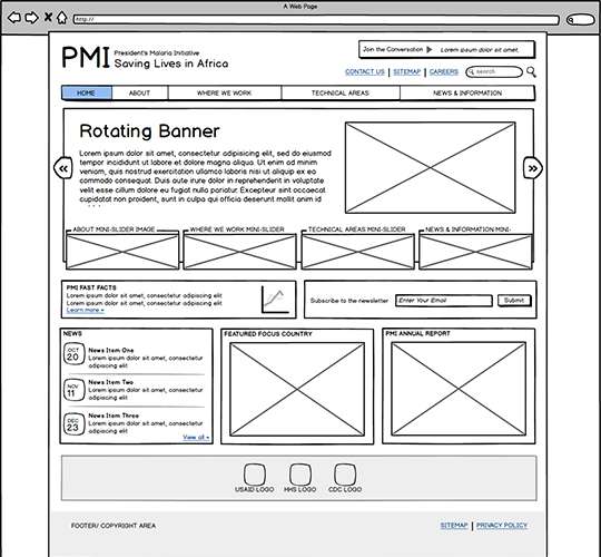
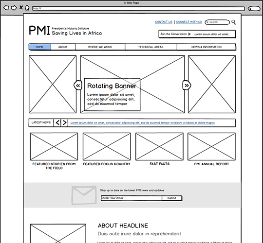
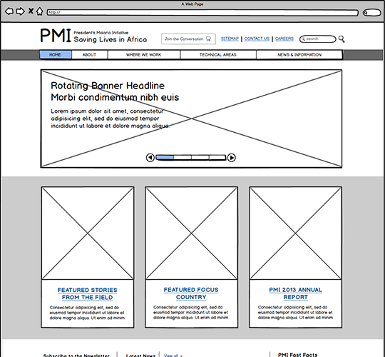
With the redesign, I started out with an analysis of the information architecture. I audited the site and identified pages that were hard to access and sections that could use improvement. I met with the clients to discuss what their needs, preferences, and goals were for the new site. From there a new architecture was created with a much more logical flow. Low-fidelity wireframes were created to show possible ideas, layouts and connections between pieces of information.
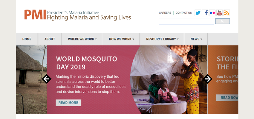
Based on client feedback, I produced several rounds of mockups and workshopped design and branding changes. I envisioned a more modern brand that inspired feelings of hope and positive impact. The new site used photos more extensively, and more thought was put into which photos were chosen. The recommended site infrastructure and navigation changes were put in place for a more frictionless experience. I also created a new newsletter template that matched the new rebrand. A Twitter feed was put on the homepage so users could see the latest updates from the initiative.
The new site was built on a CMS called SiteFinity, which was chosen for its feature set, it’s security and the developers’ past experiences with it. I coded the CSS for the site based on my mockups and assisted with the CMS implementation. We created new content types for the site that could dynamically populate in sections making it much easier to maintain. If content was moved around or renamed, the CMS would automatically update all links on the site, reducing broken links. There was now an easy to use interface behind the scenes, empowering more staff to update the site.
The only thing I wasn’t happy with was that the website was not made to be responsive or mobile friendly. I emphasized the numerous benefits for our users but was shot down. My manager made the decision to only support desktop sizes due to a lack of time and resources for our small and already overworked team.
Happy users, happy clients
Organic traffic increased to the site increased substantially. Users stayed on the site longer and viewed more pages. Downloads of reports also increased now that they were put front and center in the experience.
The new site inspired the clients at USAID. They gave us content updates more often and it became a fun and exciting experience for them to see this new way of presenting information.
Over 5 years later, my website redesign is still in use to this day and has aged well.
