New product, but old marketing
There were a few issues with both the organization and the website when I initially joined. At the time, the National Council on Aging did not have many internal staff members with strong digital and marketing backgrounds. Most media and development at the time were outsourced to various companies. This resulted in a weak brand with was no sense of cohesion, consistency or long-term vision. There was no strong social media, content marketing/blogging, email marketing, or UX strategy in place. The organization’s idea of promotion was old fashioned, with ineffective direct mail, printed brochures, and press releases. Any graphics or social media imagery used was poorly designed, boring, and used stock photos.
The newly launched website was a significant improvement from its previous integration, but now it needed traffic to drive social good, and had room for improvement. For most people choosing Medicare, it a stressful and overwhelming experience and in the end, they often pick a plan that’s not a good fit for them.
Giving users the tools and education to make the right decision
Over time a junior writer, junior marketer and a programmer were hired to round out the team. I educated them with my processes, experiences and acquired knowledge. Together with my team we helped to lead a digital transformation in the organization.
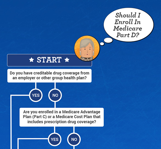
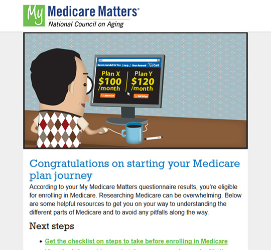
Human centered design principles were applied to put the customer needs at the heart of our products. I worked with the team to strategize and produce engaging content consistently. Strategic calls to action were placed throughout the site to improve the user journey. Better user experiences were crafted that simplified very complex topics. Instead of being overwhelmed with many the ins and outs of Medicare, they were given a clear path from beginning to end. Typically, people researching Medicare are frustrated after being bombarded with bad TV commercials, junk mail and cold calls from unreputable insurance brokers. In contrast our users were given trustworthy education, tools and unbiased advice to take action and make decisions for their future.
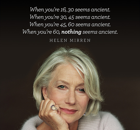
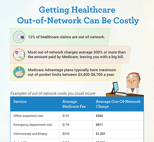
There was not a large advertising budget for the site, so driving traffic organically and having very shareable content was critical to its success. I experimented with different types of social media, took risks and looked at the data to drive future creative. We even experimented with an Artificial Intelligence tool to drive further insights on content topics, post timing, and even color and imagery to use. Cliché and unrelatable stock photos were ditched in favor of custom illustrations done by someone I had worked with in my previous job. My viral social media graphics and infographics continued to drive traffic even as Facebook altered algorithms to favor paid posts for organization. To keep people engaged we also gave health tips, inspiring quotes on aging, shared uplifting stories of older adults, even channeled their rage against the Medicare system with grumpy cat memes.
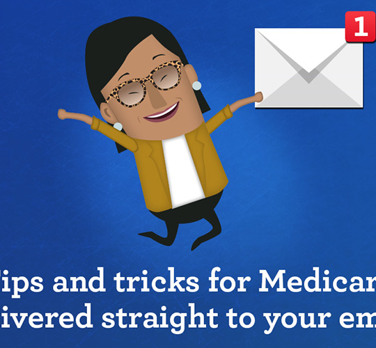
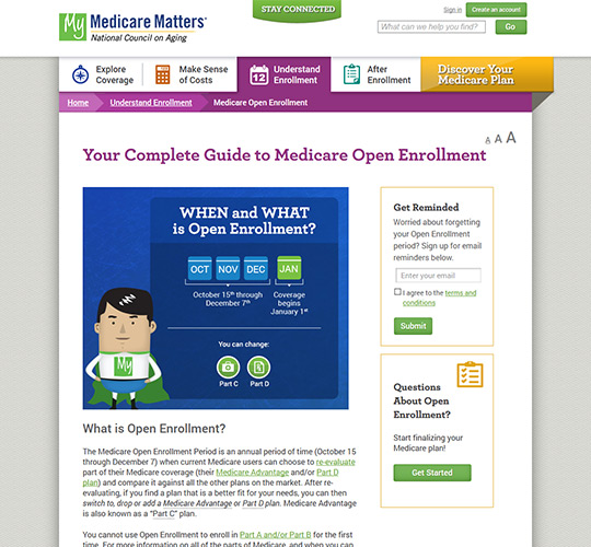
I created an email strategy that would keep users coming back. Lead ads were built in Facebook to grow our subscriber list and drive traffic without relying on constant expensive advertising. Bimonthly newsletters were sent with health tips, Medicare advice and Medicare changes. I created responsive templates as many older adults were using phones and tablets to check emails or browse the web. Users could sign up for email reminders and get notified when it was time for them to enroll in Medicare for the first time and reminded when it was open enrollment each year so they could re-evaluate any decisions made in the past. As plans change and a user’s health changes, it was important that our site drove positive behavior change so people wouldn't continue with a plan that doesn’t fit their needs.
Helping millions of older adults
- My Medicare Matters produced over $1 million in margin in its first year and continues to be sustainable 5 years later.
- Yearly unique visitors increased from 100k to over 1 million.
- Decreased cost per partner conversion 10x+ through data driven agile design/development process.
- Social media network grew from 20k to 115K users.
- Several graphics I created went viral, some even reaching 80k organic views.
- Email subscribers grew from just 900 to over 35k.
- Helped NCOA reach the goal of improving the health and economic security of 10 million older adults by 2020.
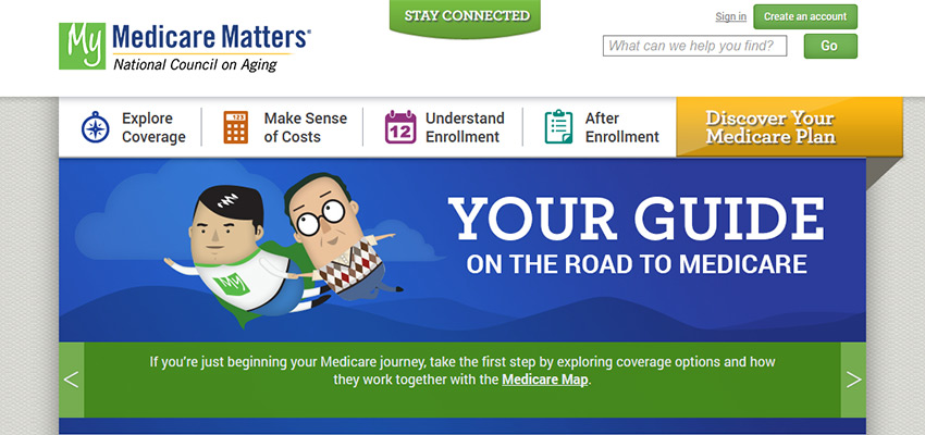 View the archived website
